Your complete toolkit for designing modern interfaces in Figma.
Take your design workflow to new heights — without limits.
UI Components
High-quality, customizable components for building polished digital interfaces in Figma.
Data Visualization Kit
Charts and infographic components for presenting data clearly.
Universal Icon Set
A high-quality icon collection for websites, apps, social media, and print.
How it works
Design smarter. Create 10x faster.
Simplify your design process and get to the finished screen sooner.
Start Creating Now
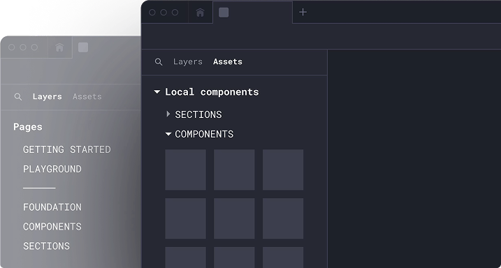
Drag and drop from a vast library of ready-made components or dive straight into a fully designed template—no setup required.
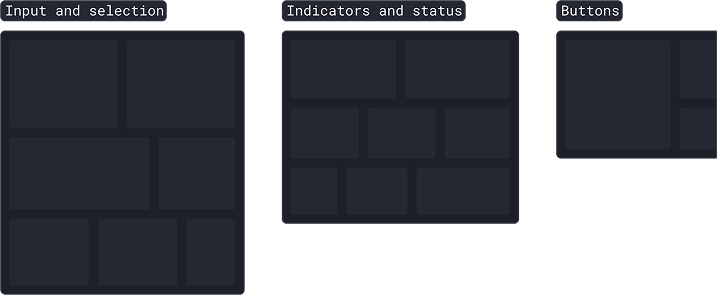
Components
Sections
Templates
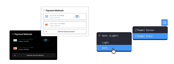
Personalize with variables
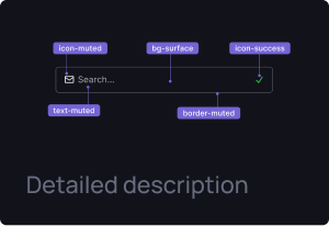
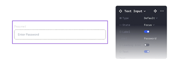
Customize components with flexible styles, properties, and design tokens to match your brand.
Light and Dark
Type
Size
and many more
Prototype with realism
Present ideas with smooth, realistic interactions that feel like the finished product.
Interactions
States
Smooth animation
Build better, faster with our
extensive component library
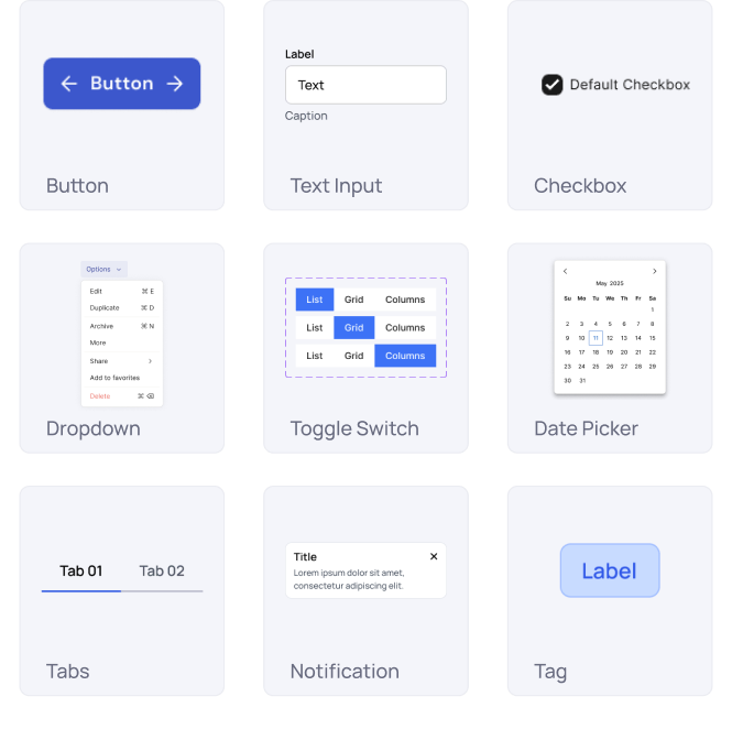
Customizable components for every common interface need: buttons, text inputs, checkboxes, dropdowns, toggles, date pickers, tabs, notifications, tags, and more.
Start effortlessly using our detailed how-to guide and tutorials
Get started without any difficulty by using a user-friendly “How to Use” guide that provides clear instructions, and then proceed with step-by-step tutorials to help you learn more effectively.
Pre-built layouts for dashboards & product screens
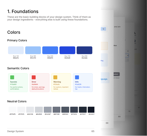
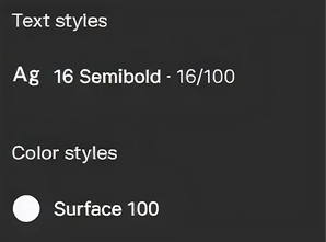
Consistent typography, spacing & color tokens
Light & Dark mode support
Fully auto-layout based components
Easy customization for brand colors & styles
Updates
Version 1.0 (Jan 1 2026)
Added core UI components & layouts
Version 1.1 (Sep 1 2026)
Added 6 new dashboard layouts
View all updates →
FAQs
Need help?
Here are answers to our most frequently asked questions.
What is the Universal Design System?
The Universal Design System is a ready-to-use UI framework that provides consistent components, layouts, colors, and typography to help teams design and build products faster.
Who is this Design System for?
It’s designed for product designers, developers, startups, and teams who want to maintain design consistency and speed up their workflow.
What platforms does the Design System support?
The system supports web and mobile products and is structured to work seamlessly with modern frameworks and design tools.
Does it include ready-made UI components?
Yes, it includes buttons, forms, tables, cards, modals, navigation elements, dashboards, and other commonly used UI components.
Can I customize the Design System?
Absolutely. You can easily customize colors, typography, spacing, components, and layouts to match your brand identity.
Is the Design System developer-friendly?
Yes, it follows clean structure, reusable components, and scalable design principles, making it easy for developers to implement and maintain.
Does it support dark mode?
Yes, the Universal Design System includes both light and dark mode styles with consistent accessibility standards.
Is it suitable for large-scale products?
Yes, it’s built to scale and works well for small projects as well as large, complex applications.
Will this help improve design consistency?
Yes, it ensures visual and functional consistency across your entire product, reducing design and development mismatches.
Can I use it for multiple projects?
Yes, the design system is reusable and can be applied across multiple products or client projects.
Does it follow accessibility guidelines?
Yes, the components are designed with accessibility best practices in mind to ensure usability for all users.
How does it speed up product development?
By using pre-built, reusable components and standardized patterns, teams can design and build features much faster.